La Familia González
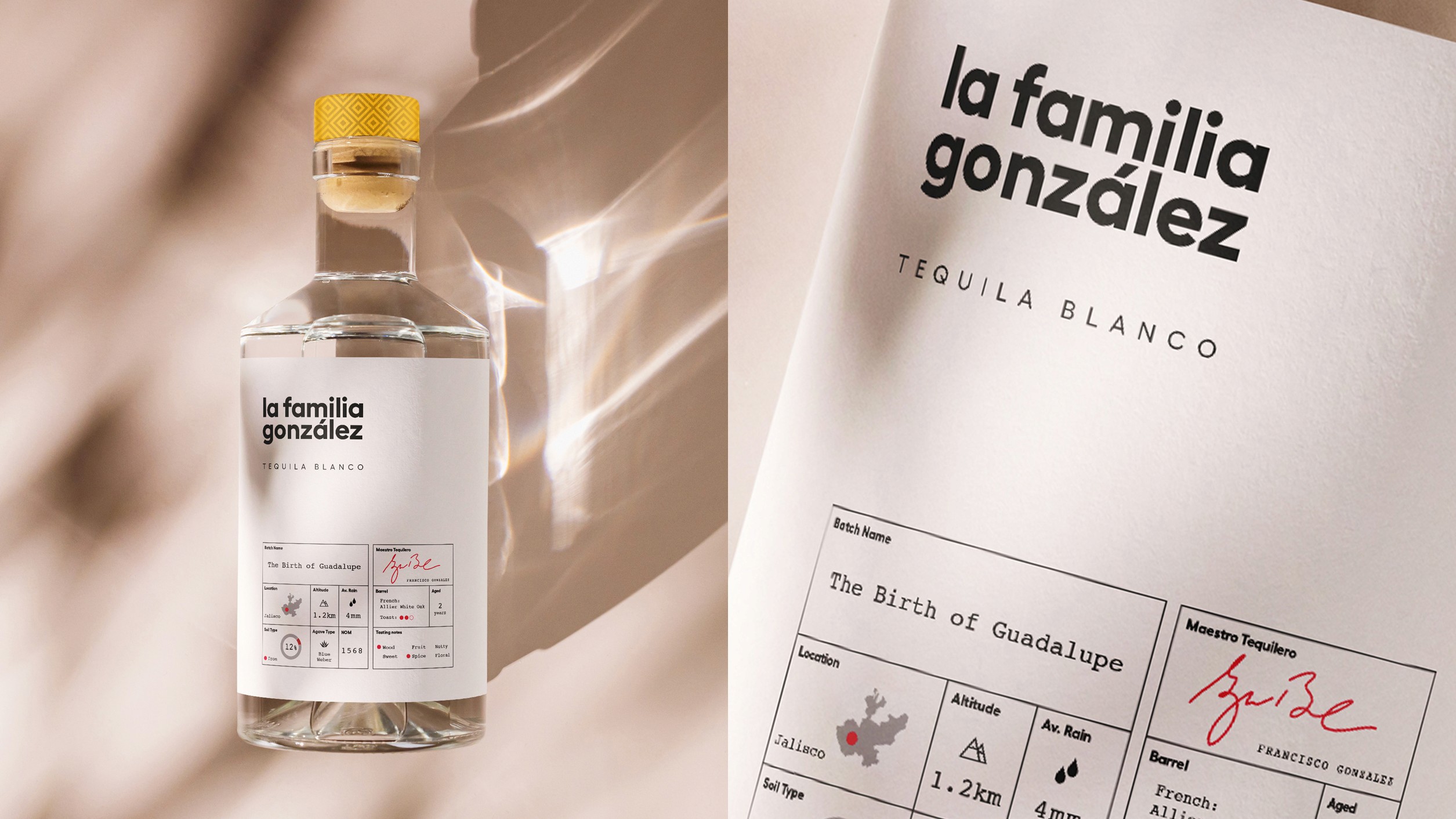
Most Tequila branding looks the same. Old fashioned, busy and cliched. We created a visual identity for La Familia González that represented the purity, simplicity and quality of the product. Clean, minimal and modern.
Most Tequila branding looks the same. Old fashioned, busy and cliched. We created a visual identity for La Familia González that represented the purity, simplicity and quality of the product. Clean, minimal and modern.




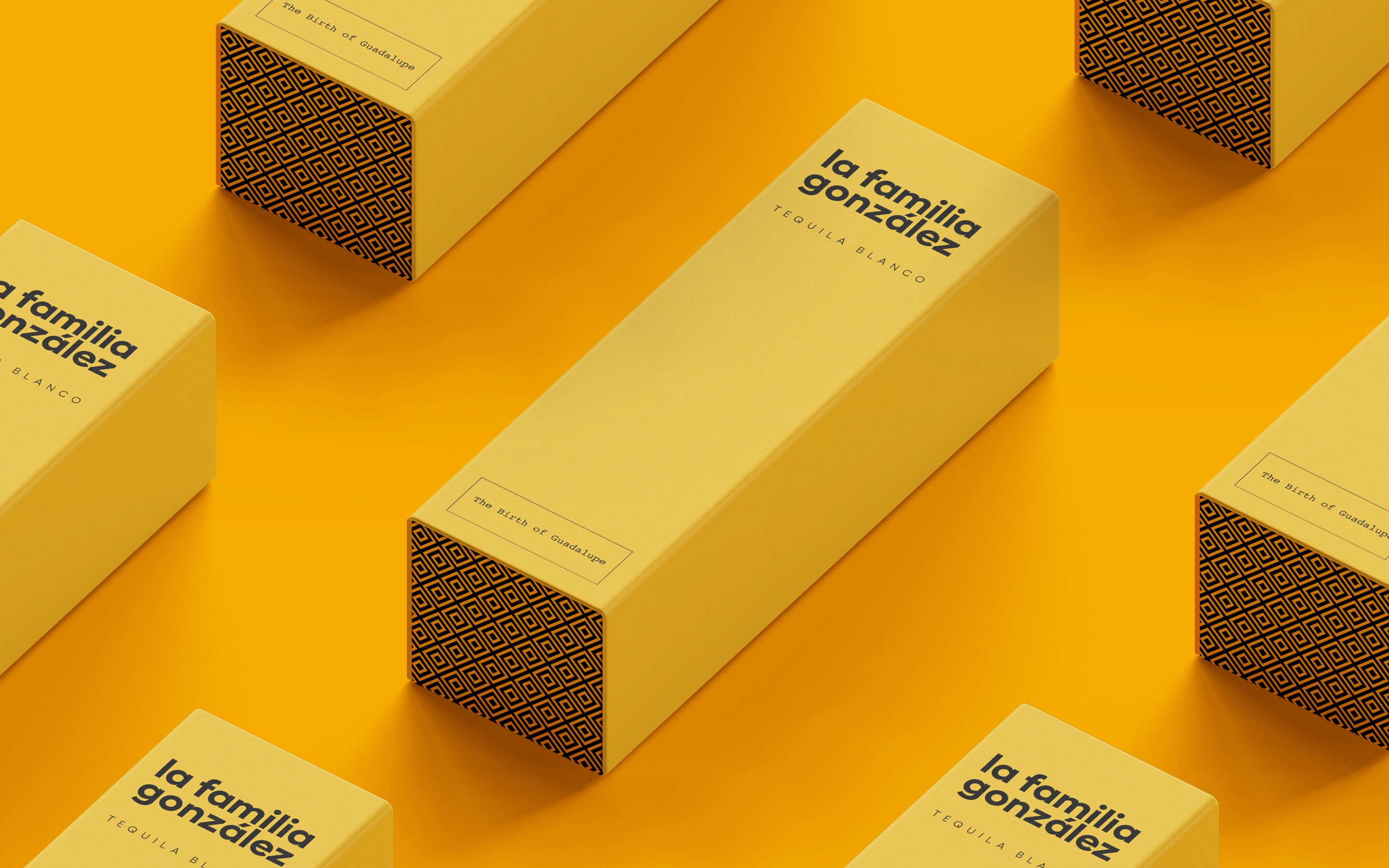
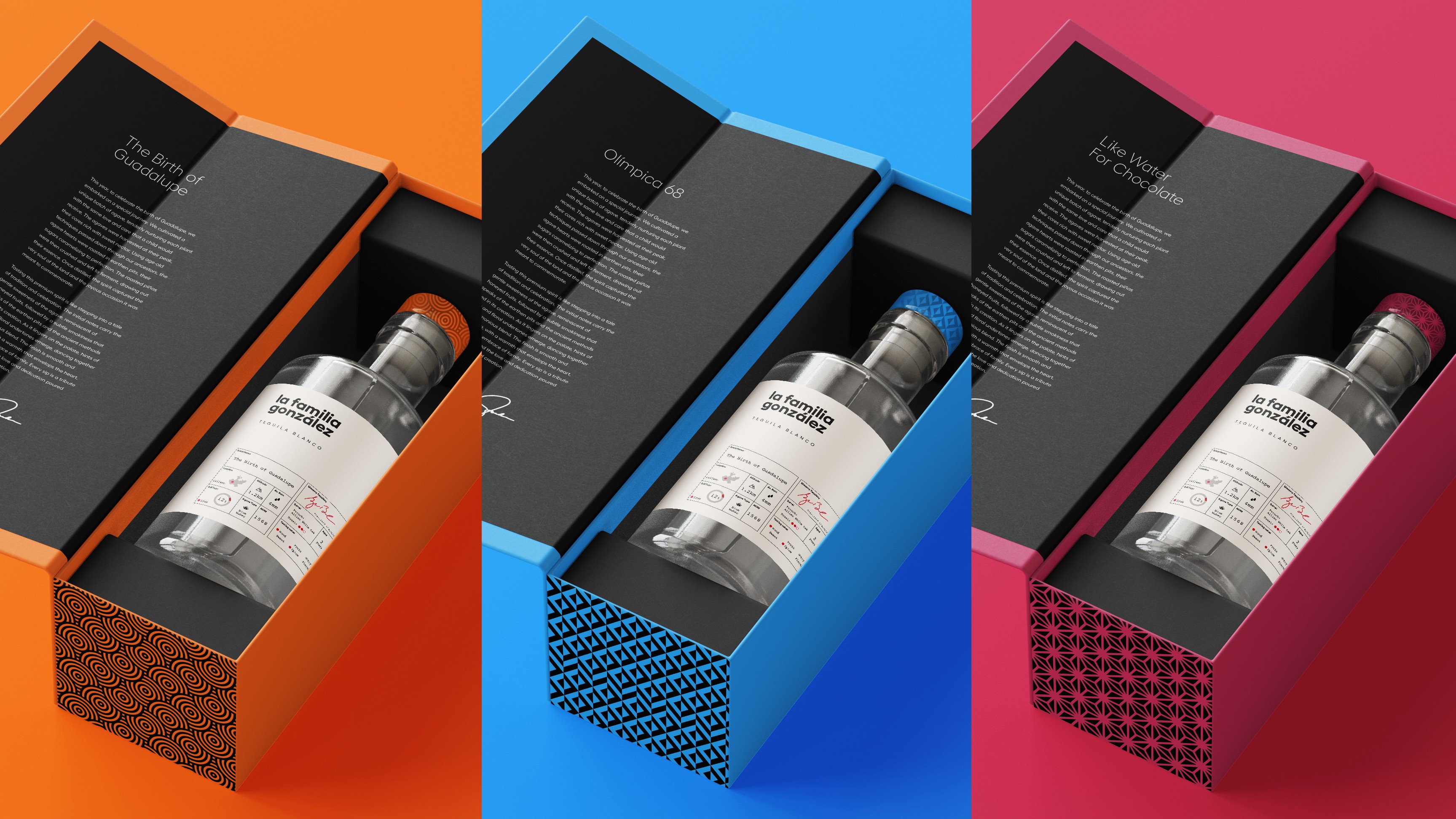
Our visual identity takes the signature aspects of Mexican art and design—geometry, patterns, and fiery colors palettes —and brings them into a sophisticated, minimal and modern design aesthetic.
Our visual identity takes the signature aspects of Mexican art and design—geometry, patterns, and fiery colors palettes —and brings them into a sophisticated, minimal and modern design aesthetic.


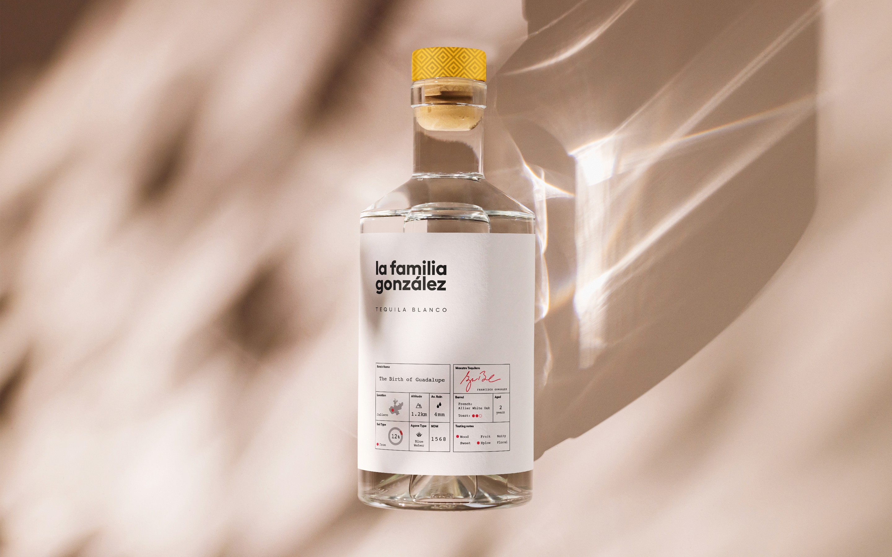


Every bottle is an expression of the mutual respect between the Gonzalez family, the farmer, and the unique character of the crop.
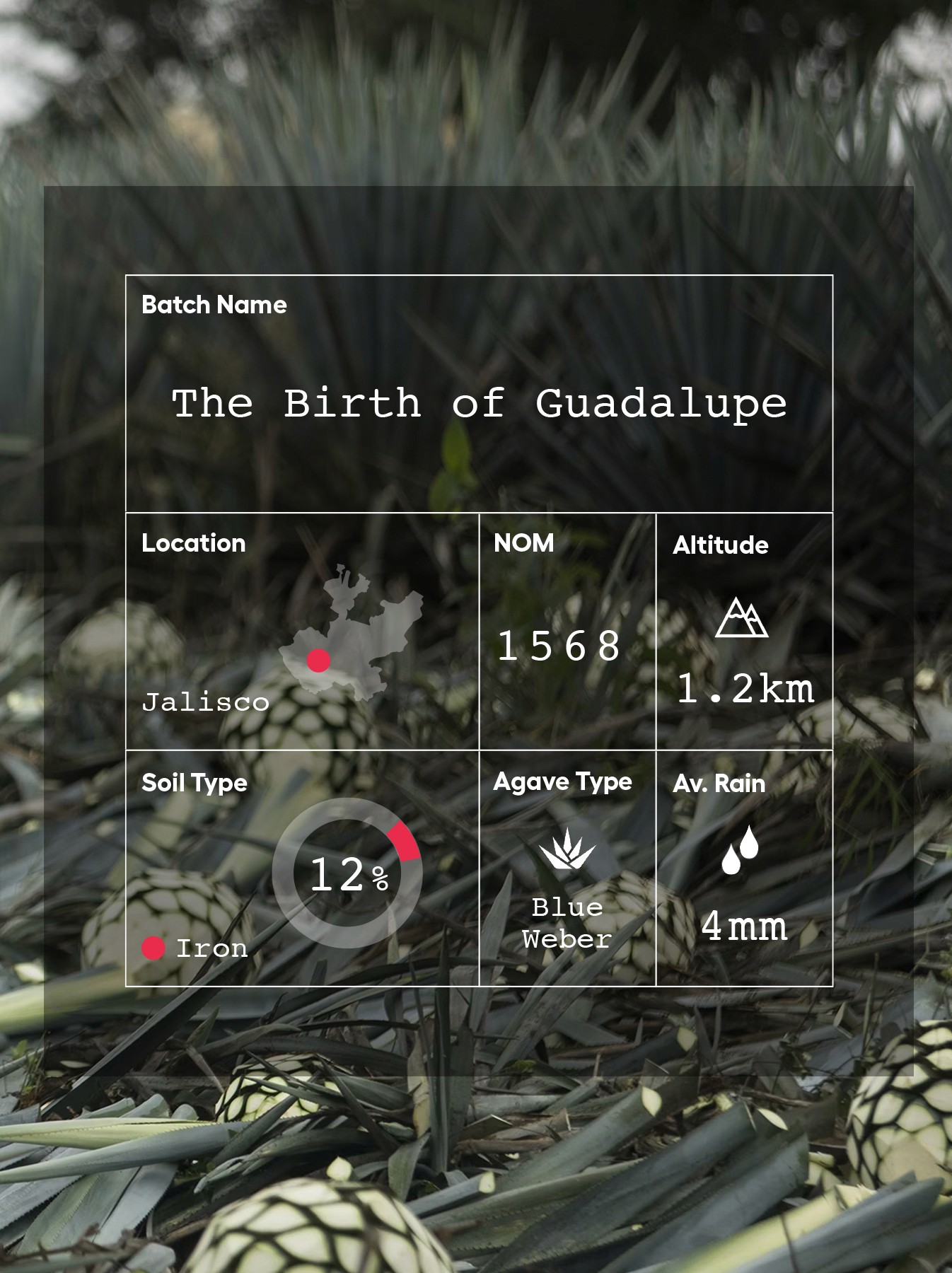
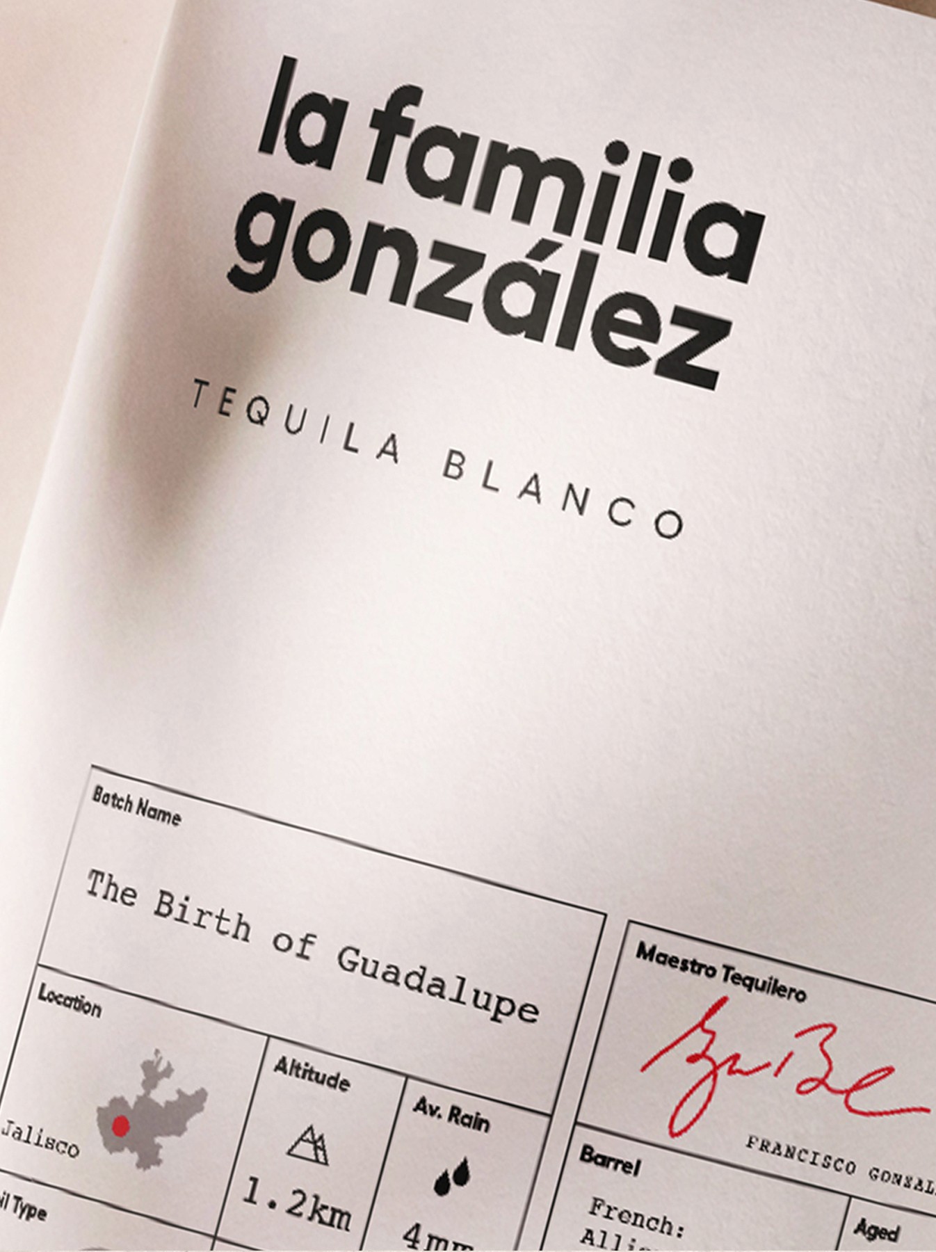
Release notes displayed on the packaging educate and inspire with a story of curation and production craft told through data.
Every bottle is an expression of the mutual respect between the Gonzalez family, the farmer, and the unique character of the crop.
Release notes displayed on the packaging educate and inspire with a story of curation and production craft told through data.

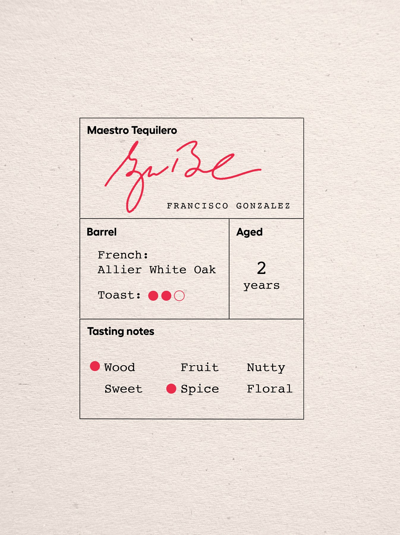

Each limited release, creates a sense of urgency and a reason for enthusiasts to pre-purchase and collect them all.
Each limited release, creates a sense of urgency and a reason for enthusiasts to pre-purchase and collect them all.



Want to work together?
Want to work together?
Current availability
We’re open for business and new collaborations.
Current availability
We’re open for business and new collaborations.
Current availability
We’re open for business and new collaborations.